
 Today I'm taking a look at Star Wars: The High Republic Issue One! Is it good? Is it bad? Maybe a little of both that's what we're going to find out right here!
Star Wars: The High Republic #1
The Artwork
 |
First and foremost I'm going to take a minute and talk about the beautiful cover from Phil Noto because I really... really... like it this looks like a book jacket which is great because you're trying to build that synergy between the novels the comic books and leading into the television show trying to build that buzz build that marketing this was a great great cover you can't really tell through the digital screen but if you look at it's very textured it looks like really really nice watercolor there's kind of a grittiness in the watercolor there's like like you splash brown dots I mean it looks really good looks aged looks uh looks exactly like uh like what I would want if I was looking at something chronicling a time 200 years in the past.
First and foremost I'm going to take a minute and talk about the beautiful cover from Phil Noto because I really... really... like it
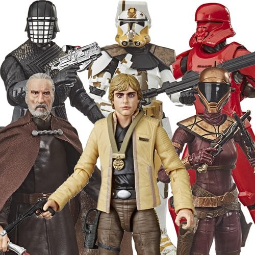 |
| Check out our Selection of Black Series Figures |
The coloring by Annalisa Leoni and the inking from Mark Morales are where this book shine. It features a ton of varying line weights and lots of washing. The coloring shifts from really dark, deep, rich, blacks to going really light . I love... love when people aren't afraid to use contrast to its full effect and they use that in spades in this book, and not just from lights to darks but also using complementary colors. This book is very green and blue and the areas where it's really green they use lots of really really strong purples really strong pinks, complementary colors and bright pops. Nothing in this book is muddy.
 |
| Shop our Force FX Lightsabers |
The Verdict
As I said there's a lot of dialogue, and luckily the dialogue itself is fine. Scott does a good job of establishing the characters, their personality and interpersonal dynamics through their dialogue, they don't beat you over the head with a lot of exposition. The plot is pretty minimal though, not a lot of ground is covered as it is mostly setup with one big reveal at the end.
This book is a solid 3.5 out of 5